Design Overview

Interface
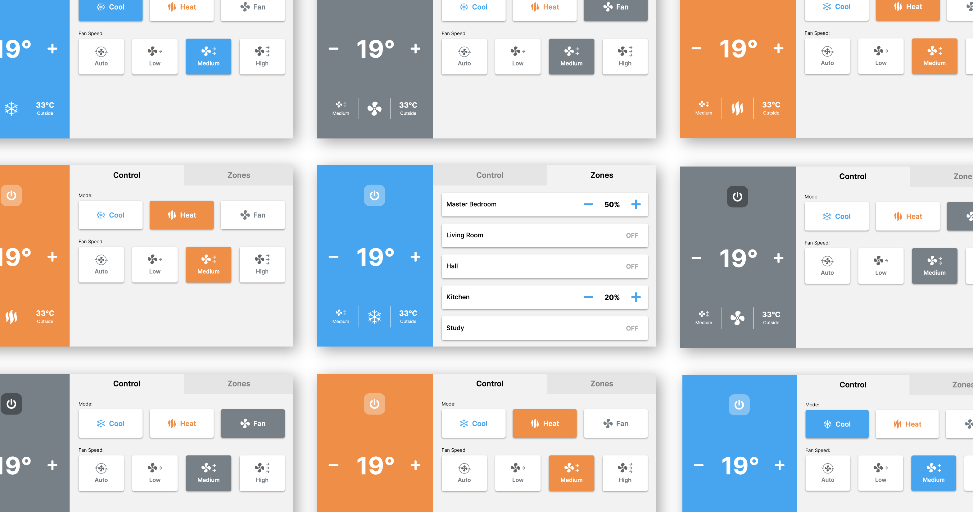
For my AirCon Controller design, I simplified the controls into three distinct
sections. I made the left side of the application primarily for system status
and prominent controls such as temperature control and power. The other two
sections, “Control” and “Zones”, feature secondary and more refined controls
for the air-conditioner. The “Control” section allows changes to mode and fan
speed, while the “Zones” section provides the ability to target and manage flow
to each specific room. These sections use subtle animations that are particularly
evident for fan speed that brings the interface to life and depict specific changes
to the system. The use of colour throughout the interface also informs the user
of the currently selected mode, whether that be “Cool”, “Heat”, or “Fan”.
Example User Journey For A Potential Scenario
Changing air flow percentage in a zone / room then adjusting the temperature degrees
SIMILIAR APPLICATION

AIRCON CONTROLLER
Simple process with information and controls readily and easily available

Experience
From looking at current air-conditioner applications, I found many not only lacked
a modern interface but lacked consideration for the end-user who may feel overwhelmed
by many controls, different menus and jargon. To show the complexity, I looked at
one application and generated a journey map detailing the process of changing the
airflow in a zone or room then adjusting the main temperature degrees. The chosen
example had a very long journey specifically because you are jumping between multiple
menus to complete simple tasks. I ensured this process was simplified for my design
by providing users with minimal menus to avoid getting lost and an overview of the
system that includes controls to the most important functions. As a result, the task
was completed with my design in four interaction points compared to the other
application, which took seven points of interaction.


