Design Overview

Interface
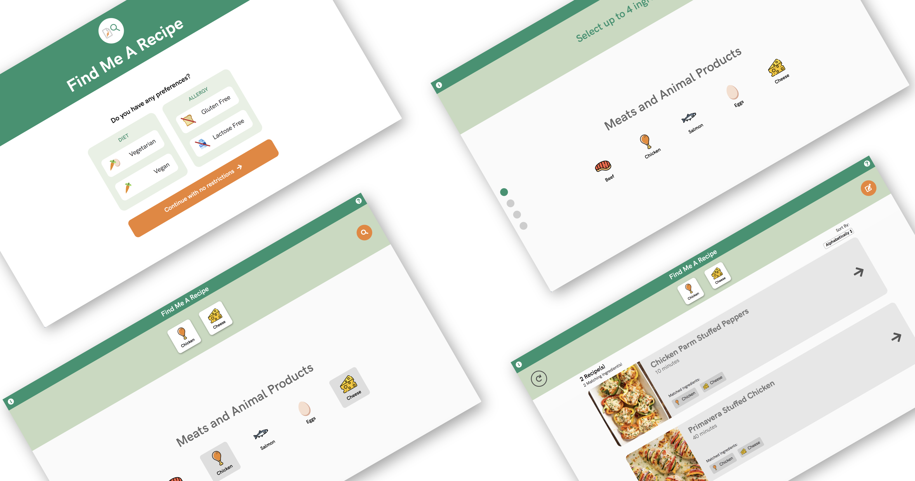
The Find Me A Recipe website was designed to be intuitive and straightforward
for the end-user. The ingredient selection, which is the most significant part
of the website, is divided into four distinct food categories (“Meats and Animal
Products”, “Vegetables”, “Grains” and “Accompaniments”) that are navigable through
scrolling which feels natural for the user. Dots placed on the left side of the
screen indicate the user’s placement in the list and allow for jumping instantly
between sections. The colour scheme is very health-focused, with the use of
monochromatic greens contrasted with an orange colour to highlight buttons and
actions. The addition of ingredient icons for both preferences and ingredients
visualise each selection and make the interface more engaging and exciting.
User Flow Diagram

Experience
The website process was designed to be quick and straightforward. It is divided
into three sections which include the selection of any diet or allergy preferences,
the choice of up to four ingredients and the results of relevant recipes. The user
starts by selecting if they have any dietary requirements so the ingredients list
can be modified for them. Once any dietary requirements have been selected, the user
can then browse the list of ingredients and choose what ingredients they have. When
the ingredients have been added, a list of relevant recipes can be viewed, clicked
on and sorted with duration. The goal of this website was to ensure that there's
no incorrect way to input ingredients. Users can click on any ingredient and remove
it from the top bar or within the list. If a mistake has been made or if there are
changes to be made to the ingredients, the website provides a button to modify
ingredients easily. Alternatively, if the user wants to start the process again,
there is a button to restart the process from the beginning.


